Mission Control
A unified internal app that grants client-facing teams the power to manage accounts across an ecosystem of apps.
Our client facing teams at OMG had a problem...
Four apps &
Zero shared data
Managing client accounts at OMG Ecosystem meant bouncing between Company Stores' Organizations pages, Distributor Central's admin view, Auturian's admin view, and OMG Intel — plus Salesforce. Every app stored client data differently and had different levels of access, sometimes requiring teams to wait for someone with the right permissions just to make a basic change.
CSMs couldn't see at a glance if a client was on multiple platforms, whether their account was a parent or child, who the point of contact was, or who owned the relationship. Simple account changes like combining, nesting, or removing accounts required an engineer. It was slow, frustrating, and error-prone.
The client-facing teams needed one place to see everything and the power to act on it themselves.
My role on the project was as a player-coach and our team brought
distinct strengths to every phase.
Andy, the primary designer on this team, led the majority of screen design and built the mini design system that ultimately accelerated both our team and engineering. I directed the overall vision, led whiteboarding sessions for naming and flow organization, ran 2+ design critiques per week, and brought the project across the finish line with the final touches like the About page. The three of us (Andy, myself, and our PM Felipe) prototyped in V0, compared flows, and combined the best of each approach.
The Process
Before any design started, we talked to the client-facing teams. We wanted to understand what information they actually needed and where the daily friction lived. Each app used different data structures, so we also had to get familiar with those systems ourselves before we could meaningfully design for them.
Early exploration in V0 with the team moved quickly into flows, detailed screens, and establishing a completely new look. Engineering moved quickly too … so fast that there were mornings we were finalizing designs while engineers were already refining tickets. That pressure forced a good decision: we built a mini design library, which gave engineering a stable set of components to build from and freed us to focus on harder problems.
One of the harder problems was getting out of our own heads. We were all deeply familiar with our existing apps which meant we kept reaching for familiar patterns and styling that were outdated. I pushed the team to resist that instinct and commit to something more modern. Going full dark mode was the clearest way to break from our existing visual language. It also served a functional purpose: dark mode made it immediately obvious to users that they were inside an internal tool, not one of our customer-facing products.
Felipe gave us creative latitude, and sometimes that created its own friction. Ideas like easter eggs, trophies for power users, and sticker collections for app exploration were genuinely fun, but fun had to earn its place. Functionality came first. Most of the playful ideas found their home in the About page, and we look forward to coming back to the rest in future iterations.
The Design
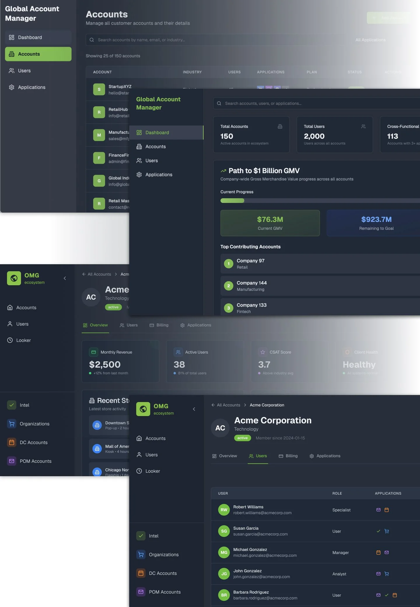
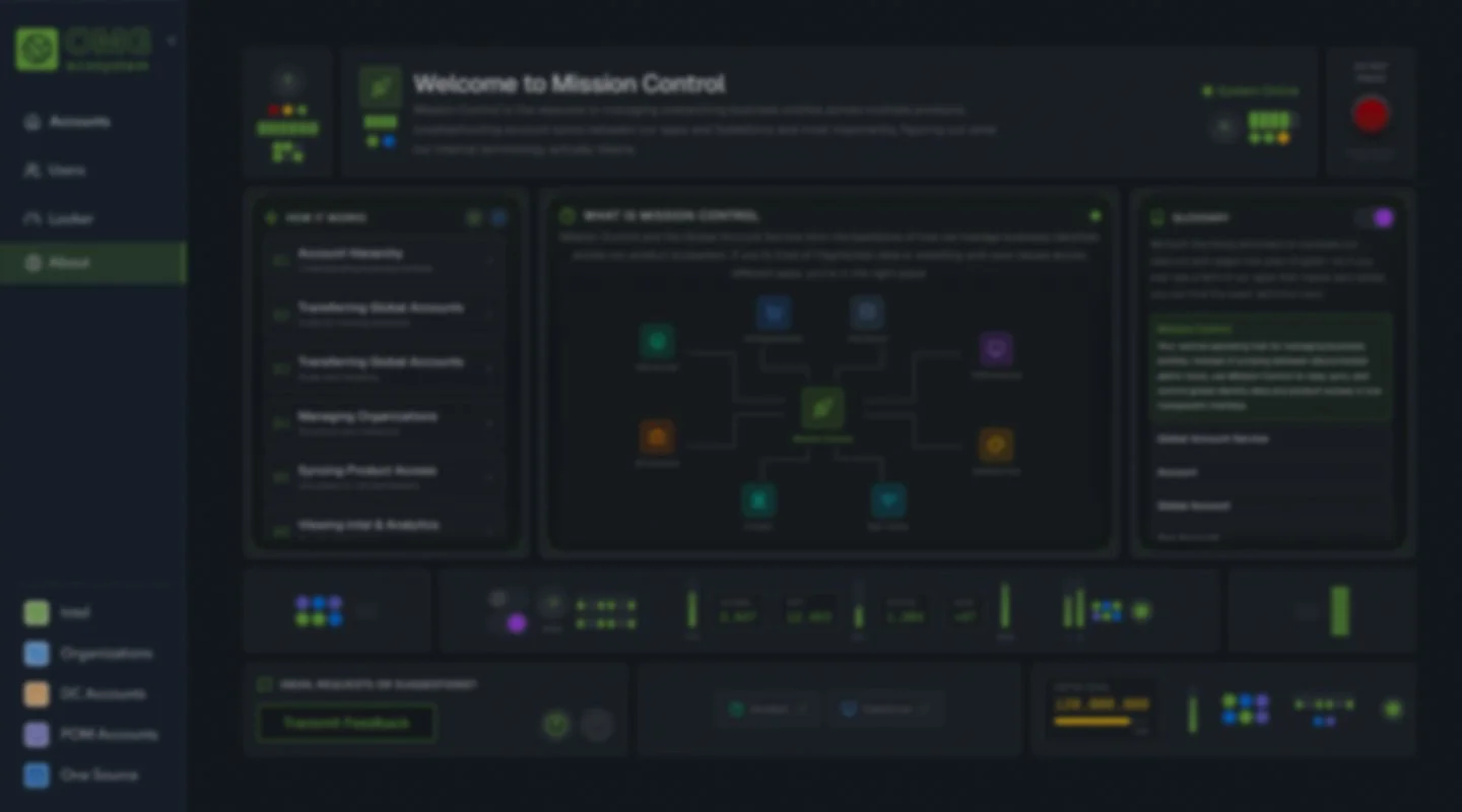
The Account Dashboard
The filtering system maps directly to what CSMs told us they needed. Color-coded app icons let you scan which platforms a client is on at a glance.
The "Path to BHAG" progress bar connects daily operational work to company-wide goals, keeping the team oriented to something bigger while heads are down.
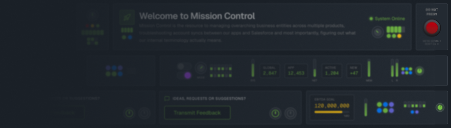
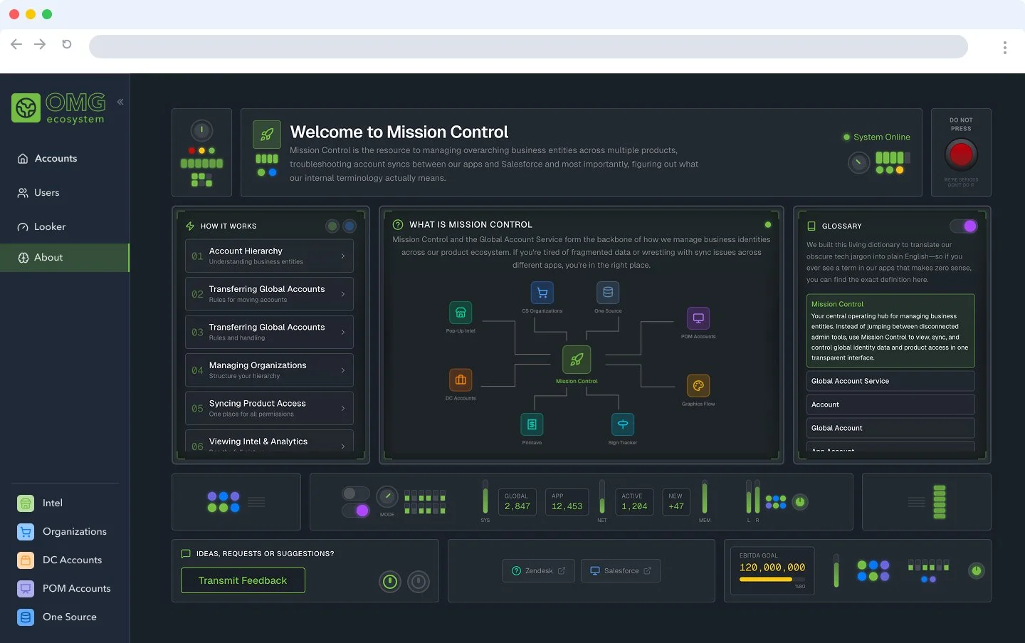
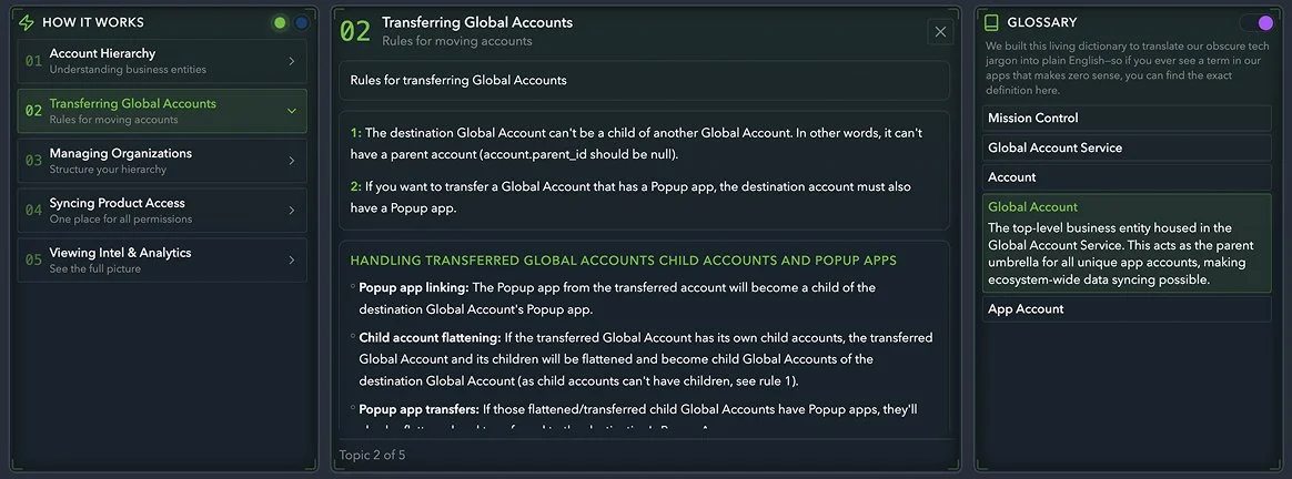
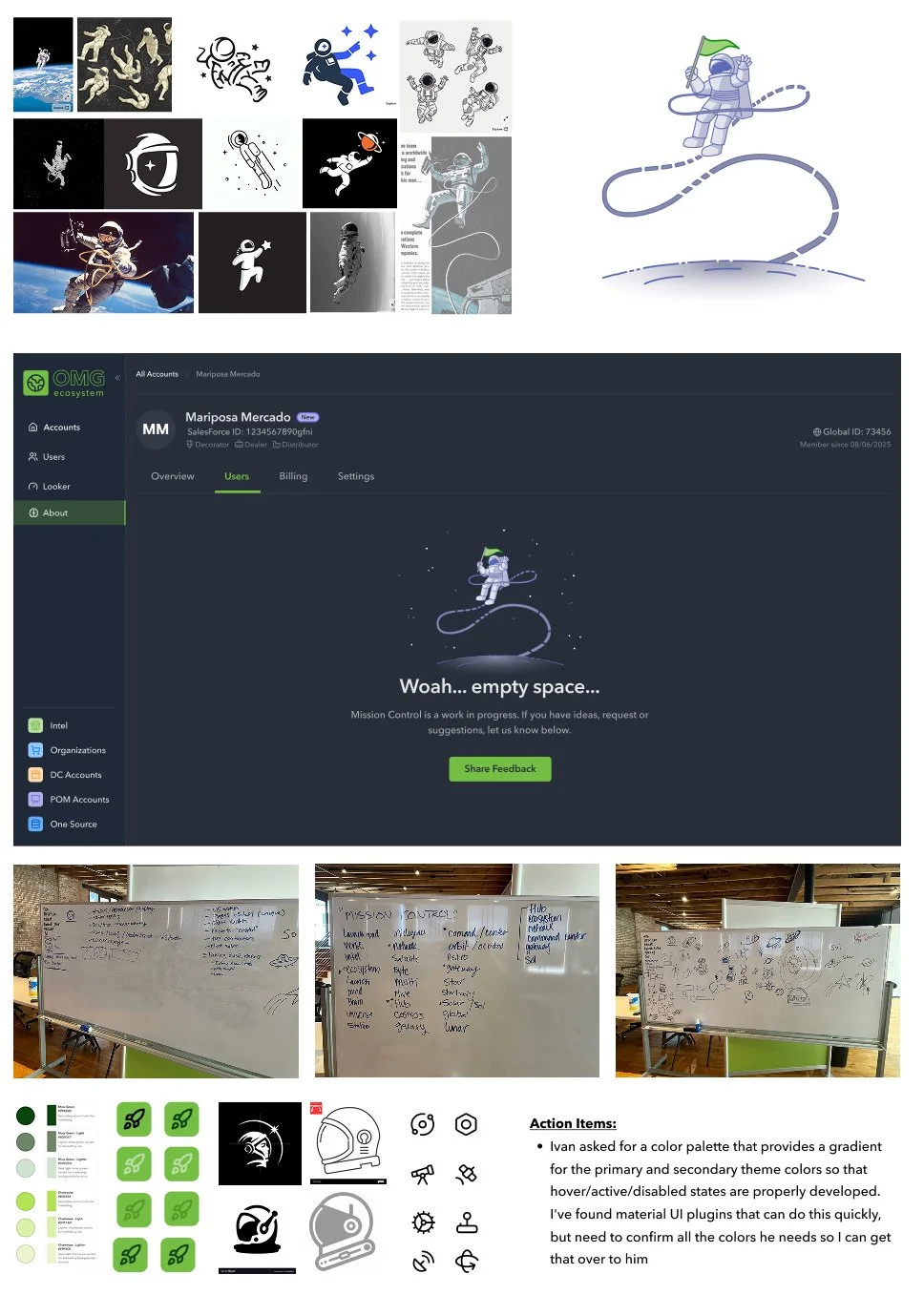
The About Page
Inspired by OMG's "Mission to Mars" ecosystem vision and the cultural moment of Project Hail Mary and Artemis 2, we leaned into the space theme early on. The "DO NOT PRESS" red button started as an engineer joke in a design review and we knew immediately it had to stay.
But the page is also genuinely functional: a glossary for new team members, a How It Works guide, a feedback channel, and an ecosystem map showing Mission Control at the center of all connected apps.
Account Details Page
The core value proposition in one view. A CSM can see a client's Global ID, Salesforce ID, role types, and every app account associated with that global account side by side. This is the screen that replaced four browser tabs and an engineer dependency.
The not-so-mini Library
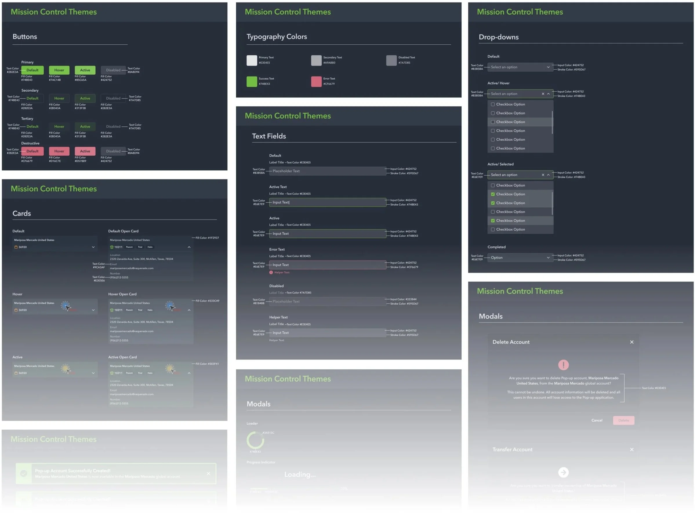
This is not a un-detailed or un-finished library but we referred to it as mini because our design system at OMG is notoriously dense and outdated. Andy worked quickly to create this design system using more up to date practices and modern colors (aka. Dark mode).
We knew we’d done good when the engineers pumped their fists after we handed these screen off.
Final Details
Empty states, illustrations and icons/logos were the last details needed to being this playful tool to life.
Because we’d saved time in the About page and committed to the tone, we had the opportunity to keep it light and keep having fun… not to mention this was an internal tool so we had some freedom to get silly.
On both the empty state pages and the about page we also wanted to give our our peers a place to send feedback. We built a powerful tool here but we want to make sure that it does not fall down the same pitfalls as our outdated tools. Luckily we’ve a very willing pool of users always willing to tell us what they think.
We went to the whiteboard first for this part of the process. I want to make sure that my team is still using the tried-and-true methods for design thinking in the new AI era.
What started as a solution for internal friction has become the foundation for how an entire suite of products will manage client accounts going forward.
Mission Control is currently being shipped. Once live, it will support global account management across 8+ apps. We spoke about future proofing the app when we were first designing it but didn’t realize that diligent work would be needed so quickly.
The acquiring company had their own internal tooling in progress. They chose to stop that work and adopt Mission Control instead.
I consider this a success.
4→1
Apps consolidated
into one view
8+
Apps supported post-acquisition
↑
Adopted by acquiring company
Learnings
This was the team's first start-to-finish project using V0 prototypes alongside Figma designs. The prototype gave us a solid jumping-off point. It would have been difficult to collaborate as quickly as we did from the beginning without flexible, low-fidelity protos. It also allowed us to have fun. When engineers can grab code directly from V0 for silly styling, glowing animations, and highly interactive layouts, it gives us all the time to play.